Motion design that drives attention and decisions
Animation designed to highlight product value
through subtle motion and sound
Animation designed to highlight product value through subtle motion and sound
Make your product stand out and stay in people’s minds
Motion and sound that make it more engaging and more likely to be chosen
Motion and sound that make it more engaging and more likely to be chosen

USER PROBLEM
You say a lot about your product, but nothing really stands out or stays with people.
GOAL
Focus on people who value design and use motion and sound to create something that feels interesting, not pushy.
APPROACH
focus on a specific audience and match the message to what they care about
use sound design as the main storytelling element instead of heavy text
show the product through sound to highlight what it feels like to use it
keep visuals minimal so attention stays on the product and its experience
use timing and rhythm to build interest and keep people engaged
RESULT
This concept shows how motion and sound can help a product stand out, build interest and
increase the chance of purchase.
PROBLEM
You say a lot about your product, but nothing really stands out or stays with people.
GOAL
Focus on people who value design and use motion and sound to create something that feels interesting, not pushy.
APPROACH
focus on a specific audience and match the message to what they care about
use sound design as the main storytelling element instead of heavy text
show the product through sound to highlight what it feels like to use it
RESULT
This concept shows how motion and sound can help a product stand out, build interest and increase the chance of purchase.
Help people understand your product and trust it enough to buy
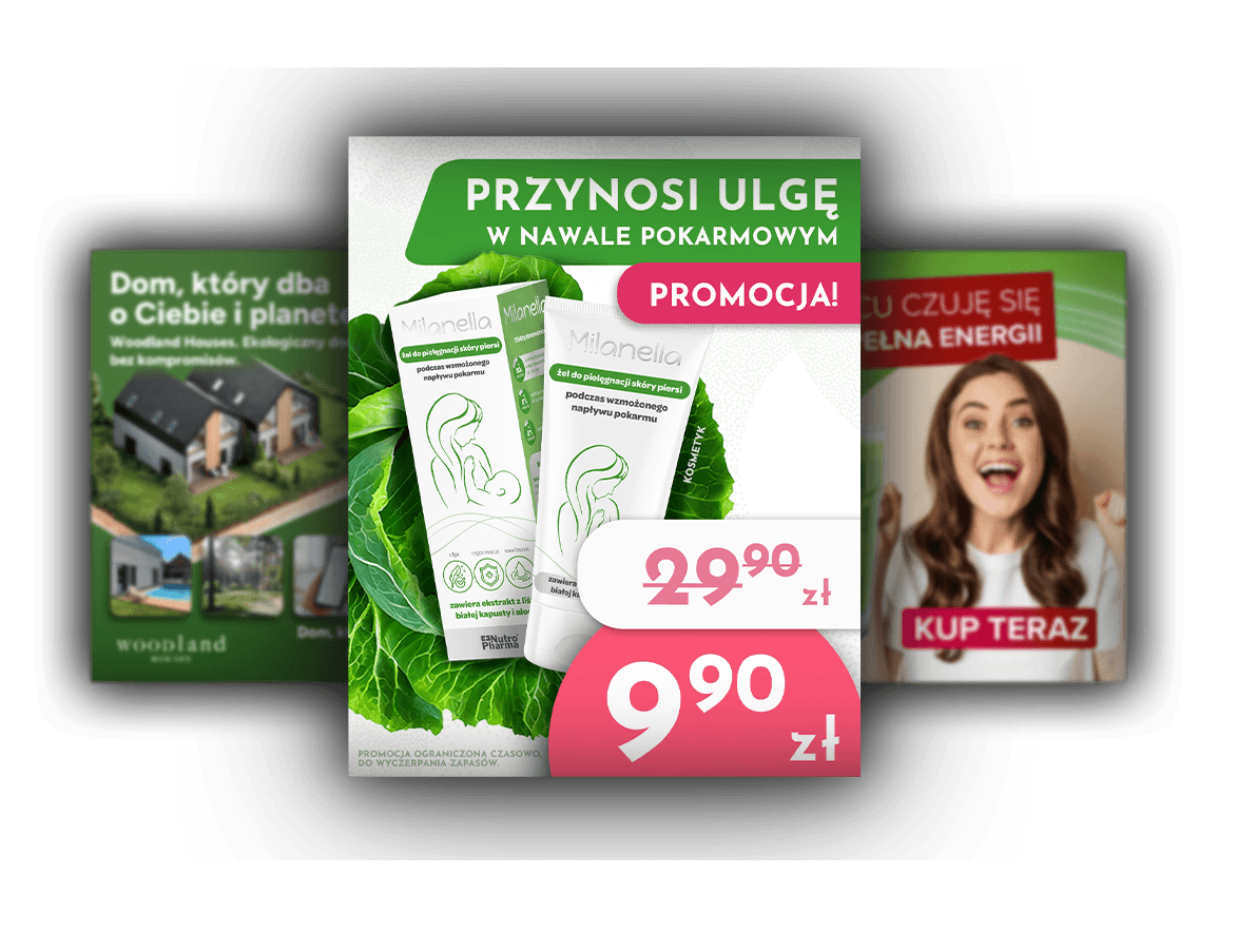
Clear product explanation designed for breastfeeding mothers
Clear product explanation designed
for breastfeeding mothers

USER PROBLEM
People don’t fully understand the product, so they hesitate and don’t trust it
enough to buy.
GOAL
Use motion to explain the product clearly and make it feel safe and trustworthy.
APPROACH
use soft, pastel colors to make the product feel safe for babies
show key ingredients with close-up motion to catch attention
use simple text so the product is easy to understand
show a mother with a baby to create trust and emotional connection
RESULT
This concept shows how clear motion can help people understand the product,
feel safe and be more likely to choose it.
PROBLEM
People don’t fully understand the product, so they hesitate and don’t trust it
enough to buy.
GOAL
Use motion to explain the product clearly and make it feel safe and trustworthy.
APPROACH
use soft, pastel colors to make the product feel safe for babies
show key ingredients with close-up motion to catch attention
use simple text so the product is easy to understand
show a mother with a baby to create trust and emotional connection
RESULT
People feel more confident and reassured, which makes them more likely to choose the product.
Help users understand faster and choose with confidence
Make it easier for users to understand and move through the product.
USER PROBLEM
Users don’t understand what to do in the first steps, so they leave before
reaching the point of action.
GOAL
Use motion to show users what to do and make the booking process feel simple from the start.
APPROACH
show the full path from start to booking in a simple, step-by-step way
use calm motion to draw attention without overwhelming the user
guide the eye to what matters in each step
use smooth transitions so each screen feels like a natural next step
RESULT
This concept shows how clear motion can guide users, reduce confusion
and increase the chance they complete the booking.
PROBLEM
Users don’t understand what to do in the first steps, so they leave before
reaching the point of action.
GOAL
Use motion to show users what to do and make the booking process feel simple from the start.
APPROACH
show the full path from start to booking in a simple, step-by-step way
use calm motion to draw attention without overwhelming the user
guide the eye to what matters in each step
use smooth transitions so each screen feels like a natural next step
RESULT
Users understand what to do faster and are more likely to complete the booking.
Sauna App - UI Visual Assets for Wordware
(YC-backed, $30M seed)
Sauna App - UI Visual Assets for Wordware (YC-backed, $30M seed

I contributed UI visual assets for this project - preparing and transforming selected interface elements into a glass-style treatment used in the final animation produced by the Wordware team.
Turn waiting into a clear and reassuring experience
Designing clarity and continuity during waiting states
Visualizing how motion guides
user decisions during booking
USER PROBLEM
Users don’t know if the system is working, so they lose trust and assume it’s slow or broken.
GOAL
Use motion to reduce uncertainty during waiting and keep users reassured that the system is working.
APPROACH
show continuous motion to indicate the system is active
design smooth loops so waiting feels uninterrupted
use subtle changes to signal progress without distracting the user
create a clear visual rhythm that makes the process feel responsive
RESULT
This concept shows how motion can make users feel that the system is working, reduce uncertainty and make them more likely to stay instead of leaving.
Make your brand memorable and chosen
Using motion to communicate brand emotion without direct advertising
PROBLEM
People ignore direct product messages, so the brand doesn’t feel interesting or memorable.
GOAL
Use motion to tell the brand story through feeling, not direct selling.
APPROACH
use unexpected 2D/3D-like transitions to stop attention in a busy feed
design dynamic transitions that keep people watching without text
use strong sound design to grab attention in the first seconds
show the product through motion and sound instead of direct messaging
add a subtle visual story (couple illustration) to suggest connection without saying it
RESULT
This concept shows how motion and sound can make the brand feel more interesting and memorable, making people more likely to choose it instead of ignoring it.
PROBLEM
People ignore direct product messages, so the brand feels easy to forget.
GOAL
Use motion to tell the brand story through feeling, not direct selling.
APPROACH
• use unexpected transitions to stop attention
• design motion that keeps people watching
• use strong sound to grab attention fast
• show the product through motion, not text
• add a subtle story to suggest connection
RESULT
This concept shows how motion and sound can make the brand more memorable and more likely to be chosen.
Character animation that captures attention
Character animation that captures attention

CLIENT GOAL
Create a consistent character-driven animation that makes the product more engaging and easier to connect with.
APPROACH
define the visual direction based on the client’s Pixar-style references to keep the brand consistent
create moodboards and refine the style to feel warm, clear and approachable for the audience
design characters and scenes to support a simple, easy-to-follow story
use AI tools (Kling, Hedra) to explore and animate character movement, then refine and control the final animation in After Effects
build the full animation, pacing and transitions to keep attention and support the message
RESULT
This project was created for a client as part of a wider team. Based on the provided script, I was responsible for the full visual system - from moodboards and storyboards to character design, animation, sound design and final edit - turning the message into a clear and engaging story that is easier to understand and more memorable
CLIENT GOAL
Create a consistent character animation that feels engaging and easy to connect with.
APPROACH
• define visual direction based on client references
• create moodboards
• design characters and scenes for easy storytelling
• use AI (Kling, Hedra) + refine in After Effects
• animating and sound design
RESULT
Created for a client as part of a team.
I owned the full visual system - from style to final animation - making the story clear, engaging and easier to remember.
Logo animation that reinforces brand meaning
Translating brand meaning into motion
PROBLEM
The brand’s meaning isn’t clearly communicated, so the logo feels flat and easy to ignore.
GOAL
Use motion to clearly express the brand’s meaning and make the logo feel more dynamic and recognizable.
APPROACH
• focus on precise timing to control how the logo is revealed
• use a simple pulse to express growth and draw attention
• highlight key elements to guide focus and build meaning
• use sound design to reinforce motion and add impact
RESULT
This concept shows how even a simple logo animation can make the brand feel more dynamic, meaningful and easier to recognize.
PROBLEM
The brand’s meaning isn’t clearly communicated, so the logo feels flat and easy to ignore.
GOAL
Use motion to clearly express the brand’s meaning and make the logo feel more dynamic and recognizable.
APPROACH
• focus on precise timing to control how the logo is revealed
• use a simple pulse to express growth and draw attention
RESULT
This concept shows how even a simple logo animation can make the brand feel more dynamic, meaningful and easier to recognize.
continue
exploring
Explore the full scope of my work
continue exploring
Explore the full scope of my work