Brand systems built
from scratch
Brand systems built
from scratch
Visual systems designed to attract customers and keep brand communication clear, based on careful research
Visual systems designed to attract customers
and keep brand communication
clear, based on careful research.
Strategic branding designed
to attract clients
A complete brand system created to help the agency stand out, build trust and communicate clearly with potential clients

Logo design
Human connection
as a brand signal
The agency wanted a brand that feels human and approachable, not distant or corporate.
To support this, the logo combines a clean structure with a handwritten element - a subtle signal of real people behind the service, helping build trust with potential clients.

Visual system
Color designed
to influence brand perception
The color palette was based on visual perception and brand psychology.
Yellow signals energy and openness, while black adds professionalism and clarity -helping the brand stand out in crowded social media feeds while maintaining a trustworthy image.


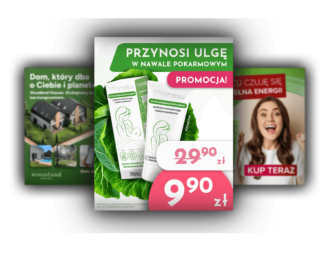
Social media ADS
Ads designed to stop the scroll
These ads were designed to capture attention and communicate the offer within seconds. Strong contrast, clear hierarchy and bold highlights guide the viewer to the key message quickly, helping turn attention into real inquiries.
Translating brand into physical assets


Brand items

Brand video
Authenticity as the foundation of brand communication
The promotional video was created to show both the professionalism and the human side of the agency. Real footage from team meetings was combined with selected visuals to present the people behind the brand and strengthen credibility with potential clients.

Brand video
Sales start
with attention
In crowded markets, visually appealing content alone is not enough to attract customers.
This animation was designed to capture attention in the first seconds and clearly communicate the value of professional marketing support.
The narrative structure highlights the contrast between ineffective advertising and strategic marketing, helping viewers understand why the agency’s approach delivers better results.
As a result, the animation works as a practical sales tool that supports lead generation and client acquisition.
The goal was to create a brand that feels more human and approachable.
I translated this idea into a full visual system - from a handwritten logo to a carefully chosen color palette designed to build trust and help the agency connect with potential clients.

Visual system to attract
young participants
A complete visual system designed to make the program clear, trustworthy and appealing to young participants.
Brand communication designed to build
credibility, attract young talent, and support
the transition from education to the job market
Visual system
Young target group
The visual style was created to make the program feel clear, modern and easy to connect with for younger people.
Clean layouts, light colors and simple compositions helped present the program in a more open and approachable way, while keeping the communication professional and easy to understand.

Brand consistency across print


Brand consistency across print
This project was designed for young graduates in Poland.
The visual style focuses on clarity, trust, and a professional tone to encourage young people to join the program and continue their careers in Poland.
All design decisions were made to feel credible, accessible, and supportive.
Book
A publication designed to support the program
The publication was designed as a clear and structured communication tool for the program. Its role was not only to look professional, but also to organize a large amount of content in a way that felt readable, consistent and easy to follow for the audience.


Visual system designed to build trust in financial services
Visual system designed
to build trust in financial services
A posting system tailored to the financial industry and the needs of the audience
A posting system tailored to the financial
industry and the needs of the audience
The post system was designed to help the accounting firm communicate expertise clearly and build trust with potential clients.
Clear layouts and strong information hierarchy make complex financial topics easier to understand, while a consistent visual structure keeps the entire feed professional and recognizable.

Visual system
Social media system built to communicate expertise
The post system was designed to help the accounting firm communicate expertise clearly and build trust with potential clients. Clear layouts and strong information hierarchy make complex financial topics easier to understand, while a consistent visual structure keeps the entire feed professional and recognizable.
A clean and consistent visual system for a multi-product supplement brand.
The design builds trust, feels modern and premium, and uses color to clearly distinguish product variants.
Visual system designed to sell
a multi-product supplement line
Visual system designed to sell
a multi-product supplement line


Visual system
Design that makes the product line clear and recognizable
The aim of the project was to design a consistent visual system for a brand of dietary supplements that promote healthy and beautiful hair. The key assumption was to create communication that simultaneously builds trust, emphasizes the effectiveness of the product, and strengthens the emotional sense of care and closeness directed at women.
The design decisions were based on simplicity, lightness, and modernity of form - so as to visually convey the character of the product as easy to use on a daily basis, yet premium and conscious. Each color in the system corresponds to a specific version of the product, which allows for clear orientation in the offer comprising five variants of supplements, while maintaining full consistency across the entire line.
A visual strategy that highlights the natural origin of the products
A visual strategy that
highlights the natural
origin of the products


The brand sells products that come directly from the forest, so the main challenge was to clearly communicate their natural origin and authenticity.
To achieve this, I created a visual communication concept based on hyper-realistic photo compositions, placing the products in natural forest environments. This approach helps customers instantly understand the product story, strengthens trust in the brand, and makes the products more appealing to buy.

Visual system
Visual system for product storytelling
The brand sells products that come directly from the forest, so the main challenge was to clearly communicate their natural origin and authenticity. To achieve this, I created a visual communication concept based on hyper-realistic photo compositions, placing the products in natural forest environments. This approach helps customers instantly understand the product story, strengthens trust in the brand, and makes the products more appealing to buy.
Visual communication designed to build parents’ trust
Visual communication
designed to build parents’ trust
A visual system designed to build trust and emotional comfort
A visual system designed
to build trust and emotional comfort

Visual system
A project that influences parents' decisions
The goal of this project was to design a visual system that helps parents feel confident about choosing a preschool for their child.
The communication focuses on warmth, safety and child development. Friendly shapes, bright colors and playful compositions reflect the atmosphere of the preschool while keeping the content clear and easy to understand. As a result, the feed works as a consistent communication system that helps parents quickly understand the values of the preschool and feel more comfortable making a decision.

The goal of this project was to design a visual system that helps parents feel confident about choosing a preschool for their child.
The communication focuses on warmth, safety and child development. Friendly shapes, bright colors and playful compositions reflect the atmosphere of the preschool while keeping the content clear and easy to understand.
Selling homes through emotions
Selling homes
through emotions
Visual storytelling built around identification, lifestyle and nature.
Visual storytelling built around
identification, lifestyle and nature.
The goal of this project was to create visual communication that helps potential buyers emotionally connect with the homes.
Instead of focusing only on architectural visuals, I combined house renderings with natural lifestyle imagery showing people enjoying everyday moments. This approach helps viewers imagine themselves living there, which builds trust and makes the offer feel more relatable.

Visual system
Design that builds emotional connection with the property
The goal of this project was to create visual communication that helps potential buyers emotionally connect with the homes.
Instead of focusing only on architectural visuals, I combined house renderings with natural lifestyle imagery showing people enjoying everyday moments. This approach helps viewers imagine themselves living there, which builds trust and makes the offer feel more relatable. As a result, the communication presents not just the houses, but the lifestyle they offer - making the properties more appealing to potential buyers.
Social media visuals based
on a client-defined concept
Social media visuals
based on a client-defined
concept
The use of generative characters was a strategic response to the client’s requirement for a playful, highly distinctive visual language.

Visual system
Social media visuals built around a client-defined
Pixar-style concept
This project was based on a clear client requirement to use Pixar-style characters as the core visual idea. My role was to design the full visual system around this concept and shape it in a way that attracts and engages the target audience. All layouts, colors, composition, and visual hierarchy were designed and refined in Photoshop, with full control over the final look and consistency of the graphics.

Brand video
Animation as a tool for consistent
and effective sales communication
This animation was created in close collaboration with the client and the content team, based on a ready script and communication goals. I was responsible for the full visual side of the project: storyboard, visual direction, animation, editing, pacing, and sound design. AI tools were used only to animate character speech and lip sync to a pre-recorded voiceover. All other elements - scenes, motion, transitions, and timing - were fully animated and refined in After Effects, with full creative control.

This project was based on a clear client requirement to use Pixar-style characters as the core visual idea. My role was to design the full visual system around this concept and shape it in a way that attracts and engages the target audience. All layouts, colors, composition, and visual hierarchy were designed and refined in Photoshop, with full control over the final look and consistency of the graphics.
continue exploring
See how design solves different business challenges

continue
exploring
Explore the full scope of my work